Thursday, 21 March 2013

Baked/ Logo design


These are the initial logo designs I have done for my brief Baked. I wanted to keep the logo quite simple and fun so I have gone for a typeface that is very round and quite weighted. The cake icon in the letter A is there to visually represent the cakes.

I tried experimenting with the cake in various places of the word Baked, but using it in replacement of the letter A but it made the word too hard to read. I also experimented with the cake with whether or not to have a stroke around the cream or to have it silhouetted out.


Tuesday, 19 March 2013

Geek Table/ Brief Four

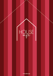
For the fourth Geek Table brief we had to design something that represented our alter ego. It took me ages to think of something, I even asked my friends and boyfriend what they thought. In the end I decided that I would be an amazing house wife. As much as I'd hate to stay at home and clean all the time, I know I'd be the best damn house wife ever!

I do almost everything for my boyfriend like washing and ironing, cleaning, cooking, I am just so domesticated. I dont do it because I have to or even because he asks me to, I do it because I love to look after him and help people.

Here is my response:


I wanted to create something like a business card, so I started off by designing a logo for my alter ego. I wanted to keep it fairly simple. I have experimented with different typefaces and layouts. I think the two typefaces I have chosen work well, the top typeface is Champagne and Limousines and the other is  Dawning of a new day. The house type is meant to be quite elegant and clean, much like a house wife's home and the wife type is meant to almost be like a signiture. You are only known as a house wife, you become one with the house, this is why the two words are joined together, to visually represent the commitment a house wife has to her home.

I tried out different ways of representing the house and liked the idea of a simple shape to visually show a home.


This is one of the final ideas I came up with. The colours and stripes are meant to represent luxury and wealth, almost like suede curtains.


This is the final idea, what I was thinking with the house outline was to cut it out and then cut across the two angular lines at the top of the design to shape it into a house. Right at the bottom of the design it says 'At the altar, ego', this is a play on words of wedding altar's and ego's. What I was trying to say is that at the wedding altar you become another person, being a house wife will be your 'altar/alter ego'.


Geek Table/ Brief Three

Here is my response to the third Geek Table brief which was all about guilty pleasures. This one was probably the easiest for me, its simple, my guilty pleasure is chocolate.

My favourite would have to be Cadbury's, its so smooth and creamy. This is what gave me my great idea. I was going to use the Cadbury logo and packaging to represent my guilty pleasure.

Here's how:


First off I hand drew the word guilty in the same style as the Cadbury logo. I tried to make it as similar as possible which I think worked pretty well. I then used the word pleasure in replacement for Dairy Milk. I tried out the word on a waved line like Cadbury does. I wanted my design to be exactly the same as Cadbury's to visually communicate my idea.


There was a restriction on this brief of working on 210x210 square. This wasnt ideal for my design so what I have done is made a square poster with my design on it and then below is a net for a bar of chocolate.


This bar is almost a replica of Cadbury's Dairy Milk, which is intentional (I am not plagiarising, because I am making it clear that the intention was to play on Cadbury's packaging design and logo).

ADD FINAL BAR PHOTO HERE


Geek Table/ Brief Two

The Geek Table brief for week two was to design something that represented 'being in the zone' when you do your design work. This could be anything from music to inspiration.

My response was based on a song by The Strokes called Someday, the lyrics are so meaningful. I picked out a particular line which is really inspiring and motivating 'Working so I won't have to try so hard'. From this line it means that we have to work hard now and take all the shit, so that one day we can relax and enjoy life without the worries of working too hard.

Here's my response:


ADD CUT OUT PHOTO HERE

The restrictions for this brief were the colour Orange, which is great because thats my favourite colour. I printed my design onto Orange stock from the library at uni and then hand cut the letters out.

The Geek Table once again said that my design responded well to the brief, I presented them with an A4 design but I will be doing it A2 for the final piece. Someone also mentioned that I dont really need the band's name underneath, but I think its such a good song that I would want people to easily be able to search for it online.

Geek Table/ Brief one

This is my response to the first Geek Table Brief. The brief was to represent our Geek skill by using our Geek skill.

My Geek skill is papercrafting and I also love Origami, so here we go:


The idea is that the Crane represents my love for Origami and it will then be cut out to show my love and skills within paper crafting. It will be about A3 size but with the crane fairly small, I want there to be a lot of negative space so that the crane really stands out once it has been cut out.

The Geek Table said that my design responded well to the brief. We discussed paper size and stock, I am going to be using a thick white card from the library at uni and have the final Crane laser cut to make it perfect.

Monday, 18 March 2013

Swatch/ Notebook packaging idea


So after having a little think about my concept, I know I still want the watches to be based on doodles, but I feel like the first design ideas don't highlight enough the fact that its all about the doodles. So...

I want to create a secret book/ doodle book where the packaging looks like an ordinary notebook, then you open it up and its got the watch inside a little compartment. I also want there to be a few pages before or after the watch compartment so that you can actually use the notebook for doodling. I also want to design pens using the same doodle pattern to go with the watch and packaging.


The notebook wouldnt actually be this big, I only had this size laying around to try out my genius idea. I think I am going to have to make 3 of these by hand or make them specially for this because it'll be too difficult trying to get something the exact size I need. Not only that but I need to design the front of the notebook too.


The depth of the compartment will just be deep enough for the watch so it fits in snug.


Swatch Limited Edition Packaging/ Initial ideas


This is a Swatch watch that I got for Christmas and I am basing all of my sizing on this watch. The packaging you see is what it came in. Its pretty basic really, hard plastic with Swatch embossed onto it and then inside there is some laminated card that says Swatch in it again.


Here are a few of my first ideas for the Swatch packaging. I had settled that my concept was going to be doodling as I felt it would be fun to experiment with and still left the concept quite open. The first thing I did was draw out some doodles. For some reason the doodles came out as patterns so I decided to go with it as this was my interpretation of a doodle. It took forever to draw 3 of them, which is the number of Limited Editions I am going to design.


Originally I was going to have the doodles black and white but instead picked 3 pastel colours instead, Orange, Blue and Green. Each colour what have a different shaped doodle to it. My initial design idea was to have a long and thin sliding slip case that the watch would sit in, there would then be a dye cut circle where the watch face would be seen. I then planned on using the word doodle vertical up the box so the watch face would replace one of the letter o's. The blue design has a circle doodle. This box was a little too small for the watch because at this point I hadnt measured it.


I firstly made the box bigger so the watch fitted perfectly inside, this green design uses the square doodle. I have picked a typeface for the logo but not too sure if it works because the o's and d's look very similar. The   Swatch logo was also very hard to get hold of so I need to maybe trace it as at the moment this is the biggest I can make it without it going pix elated. At the moment it just looks weird being smaller than the doodle logo, just looks a bit unbalanced.


I have tried making the inside of the pull out box a bit more interesting by using a solid colour as a raised bed for the watch so that it feels more enclosed and doesnt move around too much. This also means that when the watch isnt inside the box that its not just white underneath.


Here is an example of using the letter o as a space for the watch face to be seen, I wont be using this typeface for the final but I liked it enough to try it out. I was thinking of white foiling the other letters just to make it look a bit sexy.


I think it works really well with the dye cut circle for the watch face.


Again I have used the solid colour inside so that it isnt just a blank white circle inside.


I tried using a different typeface where the letter o was more circular. It has worked a lot better because the dye cut circle doesnt look odd like the previous example. This picture isnt the best but the type is quite prominent. 


Swatch Packaging idea


The idea for my Swatch packaging is to have the watches in a secret compartment notebook, this is because the concept of the watches is doodling so the notebook would essentially be a doodle book with a secret compartment. The watch would come inside the notebook, the idea is to make it look like a notebook that can be doodled in. The front of the notebook will have the shape doodle on it which will give an indication of the watch design inside.

I now need to figure out how to make the secret notebook.

These images were sourced from Google.com after searching 'secret book storage' www.google.com/secretbookstorage

Urban Outfitters visual merchandising


All images were taken from Google.com after searching 'Urban Outfitters Visual Merchandising' and 'Urban Outfitters Display' www.google.com/urbanoutfittersdisplay www.google.com/urbanoutfittersvisualmerchandising

For my Swatch Limited Edition brief I am going to be proposing the watches to be launched and exclusive to Urban Outfitters as I feel the style of watch I am designing would fit in with their fashion and image. I have been researching their visual merchandising and displays to see how they do things and give me some idea into what I could do for the display for my Swatch Limited Edition watches.