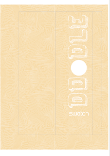
These are the initial artworks for the Orange watch packaging of which I have allocated the triangle doodle. I have played around with different typefaces and layouts of the type to see how it would look. I have tried to do it so that the word doodle runs down the length of the packaging and one of the letter O's is cut out so that the face of the watch can be seen. The watch will have the same pattern and colour as the packaging so it should also blend in but make it obvious that it is the watch face through the packaging.
These designs link to the photographs of these made up into packaging where you can see how they work with the watch inside them.


No comments:
Post a Comment