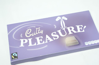
Here is what I submitted for the newspaper:
Tuesday, 28 May 2013
Geek Table Extension
I just wanted to mention that Claudia and Baljeet extended the Geek Table brief and made business cards and a newspaper containing all of our work. We each have a piece of work in the newspaper along with contact details and the individual illustration that Beth designed. The newspaper looks brilliant, we ordered enough copies to have one each to keep, we wont be giving these out to anybody. Claudia and Baljeet also designed business cards and ordered 500, we each have 62 to give out to everyone, the business cards have the Cargo web address on so people can see our work.
Saturday, 25 May 2013
Year Book/ Meetings
Throughout the process of designing the Surface Pattern and Printed Textiles PDF year book, we have had constant discussion via email with Duncan to discuss any changes needed for the year book. The main link between us and Duncan was Sophie who regularly kept Duncan up to date with the progress of the book.
We needed to request things from Duncan quite a few times because things were either missing or not correct. Near the end of the project Kirsty A began to speak with Duncan more as Sophie wasnt in. We have managed to sort everything out and got everything we needed from Duncan. It has been a pleasure working with the SP&PT course and the girls.
Frui/ Adverts
I have been playing around with the photos I took for Frui to make some simple adverts for the brand.
Frui/ Shop front
I have designed a shop front for the Frui Treatment shop that would be based in Leeds Corn Exchange. The shop is very simple as it would be a boutique shop, I just wanted something that had the logo on the outside with the fruit illustrations to cause some curiosity so people would come inside and have a look. The shop would be all white inside but there would be quite a lot of fruit around to make the shop feel very fresh.
I think the outside of the shop looks better with white on the outside, it makes it look fresher and more natural and will allow the colours of the fruit to stand out more.
Tuesday, 21 May 2013
Year book/ Layout
Here are a few page layouts of the year book to show how it'll work. The type and layout was done by Claudia and the images were edited and placed by Kirsty A and the original photos were taken by Jessie Leong.
The grid system was based on the squares and rectangles of the images and there was 3 columns for the type. The girls have done a great job of placing everything in the grid. I am useless at InDesign so I had more of an image making role rather than type and layout.
Subscribe to:
Posts (Atom)