Friday 22 February 2013

Swatch/ Luis Veiga


http://www.behance.net/luisveiga#page=1&sort=creatives_order

I love this packaging for a range of Swatch watches, the design is so unique and fun. The concept was about children and living so the use of the house for the packaging and the children and people for the watch designs works really well. The bold use of colour also work well to communicate the concept.

Swatch/ Alex Franco


http://www.behance.net/ALEXfranco

Alex Franco has designed these Swatch watches for an International Summer Volleyball event. He has used a very traditional Swatch packaging which is clear with the word SWATCH running down it. I think his main focus has been on the watch design themselves but I would like to create something that focuses heavily on the packaging as well as the watch designs.

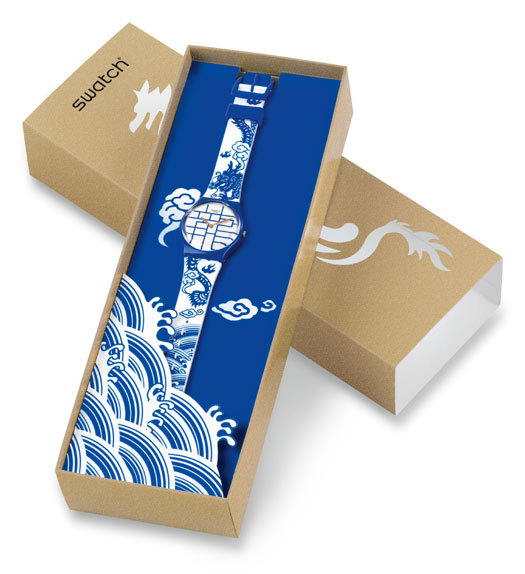
Swatch Packaging examples


I have found examples of Swatch watch packaging that is very fun and fits with the design concept of the watch itself. I am wanting this to be the case with my designs, the packaging will reflect and compliment the design of the actual watch so it all works as one.

Some of the designs use a slim line box that is similar to the width of the actual watch and some have a larger box that then have other things that come with them. I am going to be designing a limited edition pen and notepad to go with my watches because I feel it fits with the theme of doodling.

The design right at the top is probably my favourite as it uses a dye cut element that the watch can be seen through. Its a really nice idea having like a window so the watch and packaging use each other to their advantages.


Tuesday 19 February 2013

The start of a new brief/ Swatch

Tuesday 19th February (TODAY) I am starting a new brief to try and get back into the swing of things ahead of the crit in 2 days time. I am going to start my Swatch Limited Edition brief as it involves packaging which I seem to enjoy quite a lot.

I have decided on a theme for my watches and packaging which is black and white doodle. I have started to draw out some doodles using different shapes and using a black fine liner. I want the patterns to have quite a hipster feel to them, kind of like the fashion trends at the moment. The watches and packaging will have quite a loose feel to them in terms of the packaging design. The outer packaging will reflect the watch design inside. I was thinking of have the packaging quite elaborate and busy and the watch face would have a similar design, I want to keep the watch itself simple in comparison to the packaging so the two compliment one another.

I am going to be designing 3 Swatch Limited Edition designs and then create a logo for the range as well as POS and maybe some advertising.

I would like to create a range that would be aimed at 16-23 year olds who love fashion and quirky things, I'm thinking of aiming at a market who would shop at Urban Outfitters and other shops like this. The designs need to be quite raw and urban to fit in with my target audience.

Now I've drawn out my doodles I need to scan them in and vector them in Illustrator so I can start to apply them to the packaging and watch faces.

The shapes that I decided to use are basic shapes, a triangle, square and circle, I have made like a doodled repeated pattern that kind of makes your eyes go funny. They look very doodled and loose which is what I was aiming for. After I have sorted these out ready to apply to things I will need to start looking at different ways in which I can manipulate the standard packaging into something more fitting and quirky.

ADD PICTURES OF DOODLES HERE

Tuesday afternoon update

STRUGGLING WITH ANY CREATIVE IDEA. BRAIN DEAD. DESIGNERS BLOCK. BRICK WALL! CRIT IN 2 DAYS! PANICK MODE!

(Needed to get this out of my system, I'm really struggling to think of a good solid idea and its driving me crazy. With a crit on the horizon I just feel like hiding under a rock!!)

Friday 15 February 2013

A major update on the Geek Table collective

So I havent been blogging the progress of this brief weekly, so here it is all in one go up to date. So we decided that we were going to organise some kind of exhibition of our work near the end of module and the aim of the exhibition would be to invite designers and studios to come and see our work and know that we will be graduating in case they need an extra pair of hands. We wanted to basically promote ourselves to the industry outside of uni to show that we can organise things on our own as well as take part in the end of year show.

Sophie contacted White Cloth Gallery to see if we could hold our exhibition there, we had been to an event there before and its a really good space. The decision of this is still in progress.

As a group we needed to decide what we were all going to do as part of the collective, for example the branding. Because we couldnt decide we then all had a go at creating a logo and an identity and then brought all our ideas to the table to discuss as a team. We decided to Beth's logo and the pair of glasses that I created as our identity. Beth also made some amazing illustrations of us all which look so real!

We then needed to come up with some kind of concept for the exhibition because we were worried that the work we were going to produce for it would be too random. So after a few discussions we came up with the idea of creating work based upon our experiences as designers. So for example one of the briefs that we would set ourselves would be nightmare clients. So the piece of work we designed would be based upon this theme and we could do what we wanted for it. We would set ourselves design restrictions such as size and colour to try and keep pieces of work working as a set.

We came up with a few briefs that we would complete during the module before the exhibition in May. Some of the other ideas we came up with are:


  • Nightmare Clients (clients who are right pains in the arses)
  • Guilty Pleasure (things we do that we know we shouldnt when we're designing)
  • The Zone (music we listen to when we're 'in the zone')
  • Food or drink (something we cant get enough of when we're designing, like chocolate)
We have had a few problems with the bigger picture of the brief because some people got confused over the point of the brief and the exhibition and worried about whether or not people would turn up. I made a point in saying that as long as we promoted the exhibition sooner rather than later and with the amount of people we all have on Twitter to contact, then we should be fine.

We are starting the first of our briefs on Monday 18th February and then doing one every two weeks until the date of our exhibition.

For the exhibition we'll be collaborating with a third year Fine Art student whose going to help us curate the exhibition as it is something she wants to do once she graduates.

Got me a client/ Invites

A few weeks ago I posted on Facebook that I was looking to work with people to gain some experience with working on a live brief with a real client. I got quite a few responses which I managed to narrow down. One guy asked if I could make him some business cards as he's starting up as a personal trainer, the first thing I asked was his budget and I was nearly sick at his response!

'well they are generally quite expensive arent they but vista print are doing 250 for £2.99 plus p&p basically thats pretty much my budget'

Oh my golly gosh. I told him unfortunately I wouldnt be able to work with him and I wish him every success in the future if hes going to try and get business from using shitty vista print business cards!

I also had a girl ask me if I could make her some 21st birthday invites, which I accepted. I asked her everything I needed to know and she gave me quite a refined idea of what she wanted, which I guess is good. The best thing though had to be the fact she knew that print can be expensive and just told me to let her know how much it'll cost. #winning.

Here are her requirements that I will be working to


  • A5 sized but slightly slimmer so the invite looks narrow
  • Light pink stock
  • Purple text
  • Emily's 21st across the top of the invite
  • Image provided centered underneath Emily's 21st
  • All of the party info underneath the image provided
  • Around 75 invites
  • Deadline February 28th
I've been staying in contact with Emily and aim to have everything done for her by the 28th of February. I have asked her if I can give her some design ideas by next Frdiay (22nd February) and then make any tweaks and print them out.


This brief will be an additional brief that I will submit as part of FMP.

YCN UK Greetings Card concept re jig

So Ive been thinking about the concept for this brief as my original idea is becoming really hard to develop. I have already done something for this brief in the last module but it was a different concept, I really wanted to develop it further for my FMP but we cant re submit anything we've already done. So what Im thinking is to use a similar style of the Natures Little Critters brief and create some stuff about love?

I really love working in that style of illustration and see no harm in creating something similar to what I already had. I think in a way its a good thing because it means I have found an approach to design that I enjoy and Im good at. This may also mean that I can submit the whole lot to YCN rather than deciding between the two different concepts.

Here are some examples of the types of thing I would be designing


This one came from a quick idea and it didnt take me long to draw up. I want to use puns like the other cards I designed that link to the imagery. This one is 'hooked on your love' and the image is a fish hooked on a line. I really love how simple they are and how light hearted they are. The red heart would be some what of a running theme, this would be foiled on the designs to add detail. But the main focus of the cards would be the design and not so much the printing.


This one is another quick design that I think really works, in fact I gave it to my boyfriend for Valentines Day. It says 'Im sticking with you' and there is a pritt stick and a tube of super glue to represent the sticking. Again I think its a really cute card that visually works really well. The red heart is on there again so that all of the designs link together. I really want and need to develop this into a substantial amount of work so Im going to be designing gift bags, gift wrap, tags ect but also really try and focus on the branding, packaging and POS of the product range so I can fully understand how a product sale works in a shop.

YCN UK Greetings Card development

After developing a concept for the greetings card brief based on LOVE. Ive started to develop my ideas and started to make some mock ups. I have been having trouble with deciding which way to take the design concept. At first I was thinking of doing dye cut cards that come in Origami Heart envelopes, the cards would be based on things people love about their partners. The idea was to keep it fun and light hearted and make the cards personal to people. I created a survey and asked people to write one thing they love about their partner to give me some ideas as a starting point.

The whole concept came from the fact that my boyfriend always tells me he loves my shoulders and I thought this was cute and weird. I think itll be interesting to make cards that say specific things you love about someone. Its different to whats already out there which I think is really important when im designing these cards.

Some of the things that people wrote:


  • Smile
  • Eyes
  • Bum
  • Personality
  • How they sleep
  • Fashion
  • Laugh
  • Everything
  • Determination
  • Clumsiness
  • Cups of tea they make
  • Freckles
  • Stubble
  • Spending time with them
I had 33 responses which isnt a lot but there seemed to be a few of the same that kept popping up like eyes, smile and personality. Im not sure now if this is going to give me enough scope to create a substantial amount of work. I dont know what it is recently but I keep hitting a brick wall!

I really like the idea of the Origami but the more I try and test with this concept, the more I think it doesnt work. ARGHHHHH!

Heres what Ive got so far on this concept:


The above card mock ups would be laser cut out and would then go inside the Origami Love Hearts. Theyre going to have to be a square format because of the Origami envelope which makes it difficult to lay the text out in a good way. They would also have to be fairly small because of the Origami. I can manage an A3 square using 80gsm paper but no thicker or the heart doesnt fold neat enough and wont stay closed. I think this concept is a little flawed and its rather annoying!


The Origami Heart looks really cool and I havent seen anything like this being used as an envelope in the current market, its just the sizing and shape of it which is making things difficult. I am really stuck!

Changing my mind/ Lego Brief

After re reading the YCN Lego brief I have decided not to do this brief anymore. The reason being that the idea I had didnt fit with what was being asked of the brief and I dont think id enjoy it as much if I did what they were asking. The brief was to create a campaign but the target audience of Lego is obviously children and I wanted to aim my campaign at adults and base the concept on nostalgia. I also havent left myself enough time to make something substantial and amazing for the deadline in March. I am currently behind on progress of my FMP and need to start managing my time better again now that the dissertation has been handed in. I will be replacing this brief with something else along the line but for now I will be starting one of my other briefs that I already wrote so that I dont waste any more time.