
This blog contains my contextual and practical work, investigation and research for my Final Major Project at Leeds College of Art for Level 06 BA (Hons) Graphic Design.
Tuesday 28 May 2013
Geek Table Extension
I just wanted to mention that Claudia and Baljeet extended the Geek Table brief and made business cards and a newspaper containing all of our work. We each have a piece of work in the newspaper along with contact details and the individual illustration that Beth designed. The newspaper looks brilliant, we ordered enough copies to have one each to keep, we wont be giving these out to anybody. Claudia and Baljeet also designed business cards and ordered 500, we each have 62 to give out to everyone, the business cards have the Cargo web address on so people can see our work.
Here is what I submitted for the newspaper:
Kirsty Hardingham
designbykirsty@hotmail.com
www.designbykirsty.co.uk
07713487417
Geek Title: Packaging Geek
I love packaging! How creative you can be and how much fun you can have with it. I spend a lot of time ogling over beautiful packaging and in my other time I really enjoy designing it.


designbykirsty@hotmail.com
www.designbykirsty.co.uk
07713487417
Geek Title: Packaging Geek
I love packaging! How creative you can be and how much fun you can have with it. I spend a lot of time ogling over beautiful packaging and in my other time I really enjoy designing it.


Saturday 25 May 2013
Year Book/ Meetings
Throughout the process of designing the Surface Pattern and Printed Textiles PDF year book, we have had constant discussion via email with Duncan to discuss any changes needed for the year book. The main link between us and Duncan was Sophie who regularly kept Duncan up to date with the progress of the book.
We needed to request things from Duncan quite a few times because things were either missing or not correct. Near the end of the project Kirsty A began to speak with Duncan more as Sophie wasnt in. We have managed to sort everything out and got everything we needed from Duncan. It has been a pleasure working with the SP&PT course and the girls.
We needed to request things from Duncan quite a few times because things were either missing or not correct. Near the end of the project Kirsty A began to speak with Duncan more as Sophie wasnt in. We have managed to sort everything out and got everything we needed from Duncan. It has been a pleasure working with the SP&PT course and the girls.
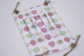
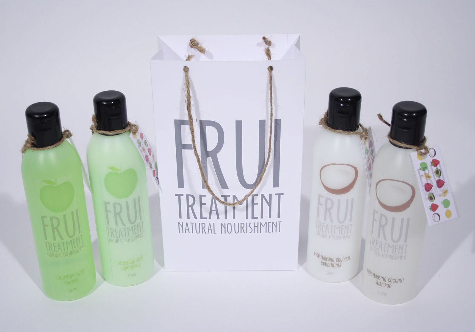
Frui/ Adverts
I have been playing around with the photos I took for Frui to make some simple adverts for the brand.


Frui/ Shop front
I have designed a shop front for the Frui Treatment shop that would be based in Leeds Corn Exchange. The shop is very simple as it would be a boutique shop, I just wanted something that had the logo on the outside with the fruit illustrations to cause some curiosity so people would come inside and have a look. The shop would be all white inside but there would be quite a lot of fruit around to make the shop feel very fresh.


I think the outside of the shop looks better with white on the outside, it makes it look fresher and more natural and will allow the colours of the fruit to stand out more.
Tuesday 21 May 2013
Year book/ Layout
Here are a few page layouts of the year book to show how it'll work. The type and layout was done by Claudia and the images were edited and placed by Kirsty A and the original photos were taken by Jessie Leong.


The grid system was based on the squares and rectangles of the images and there was 3 columns for the type. The girls have done a great job of placing everything in the grid. I am useless at InDesign so I had more of an image making role rather than type and layout.
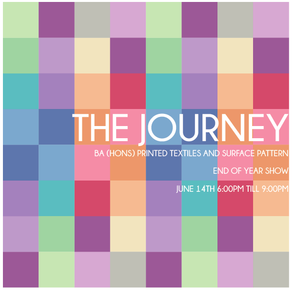
Year Book/ Re edited final front cover
Here is the final front and back cover design for the SP&PT year book. It has changed from the last post that says its the final design because Duncan and the team wanted to make some alterations including the layout of the type and the colours.


He wanted the type to be laid out a bit funkier, by moving things to left and right aligned. He also wanted the colours to be more vivid and for there to not be so many pinks and purples as he felt it looked to feminine. Some of the colours were taken from an initial design that Claudia did for the front cover, as Duncan had seen these and thought they would work well with the other colours I had chosen.

The back cover is just a copy of the front cover design but with the Leeds College of Art logo on it.
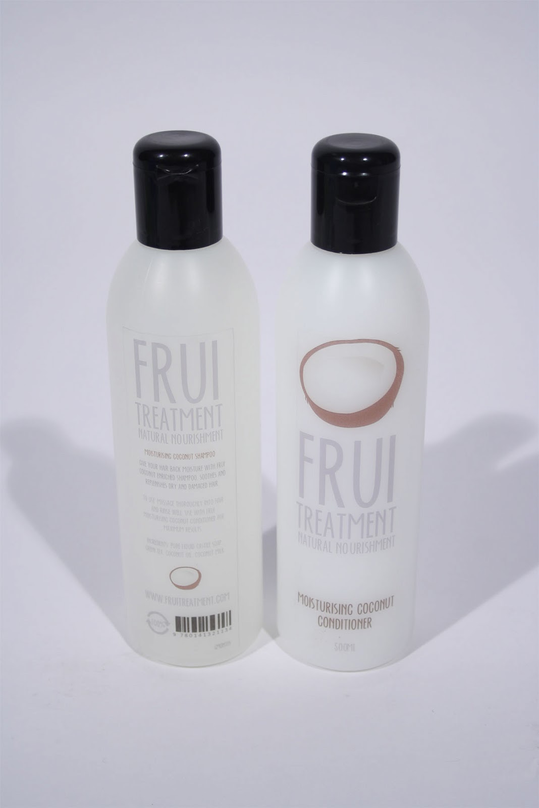
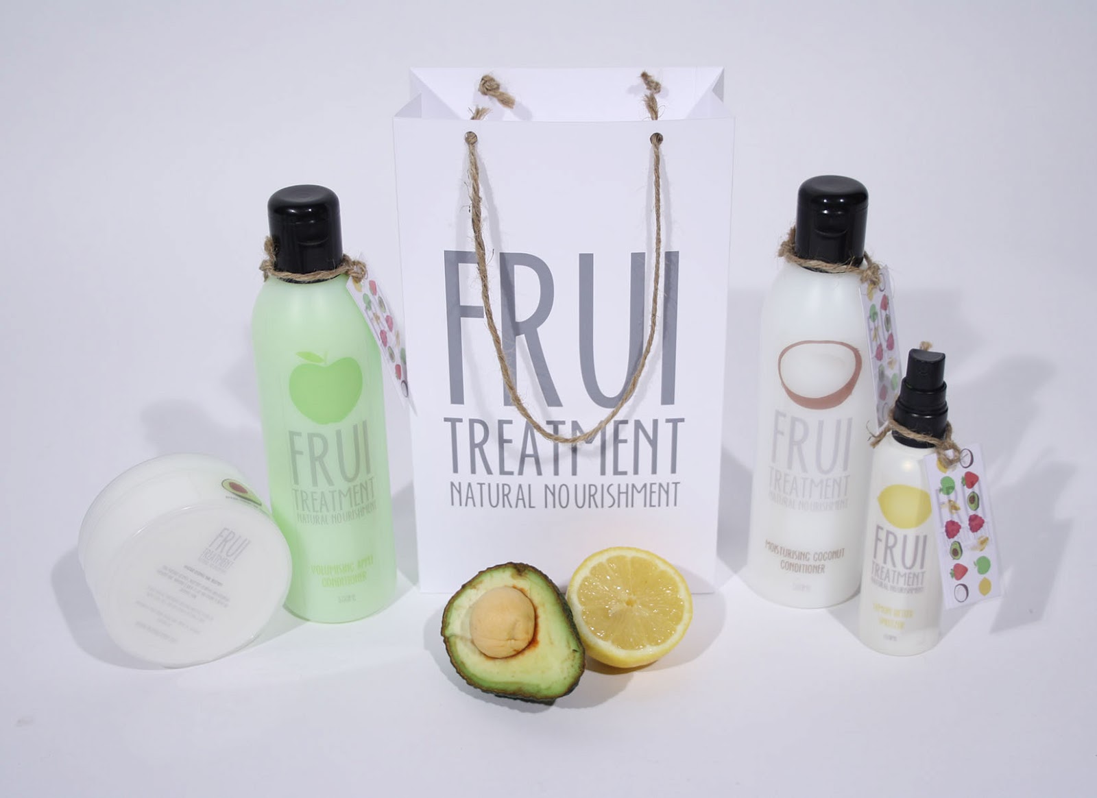
Frui/ Submission photos
Here are the contact sheets for all of the photos I took of my Frui product range.

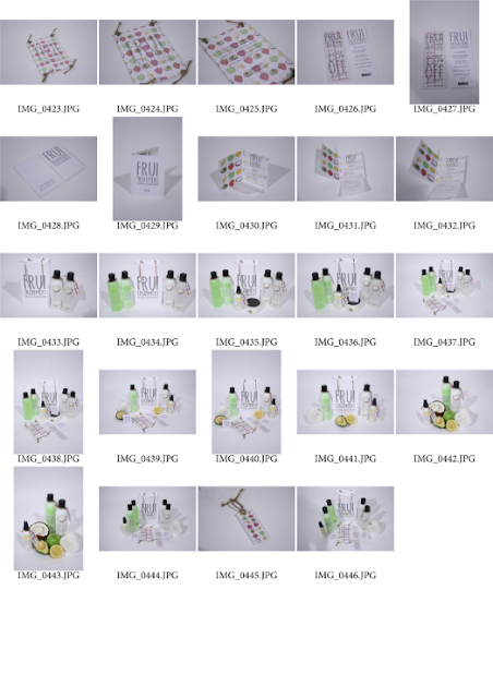


Frui/ Chosen edited photos
Here are the photos that I chose to edit ready for my Frui Treatment submission boards.


Monday 20 May 2013
Year book/ Work photoshoot
Here are the photos that were taken of the SP&PT work. Photos have been taken by Jessie Leong and edited by Kirsty Alderson. The team all helped organise the shoot, from organising people, hanging work and recording photos.


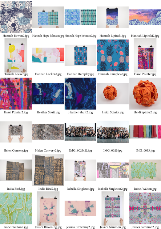
These are the photos that have been used in the year book, they were placed in my Kirsty Alderson.
Year book/ EOYS invites
I have also proposed some designs for the invites for the courses end of year show, I again wanted to use the theme of the coloured squares from the front cover design and also the typeface.
I have kept the design quite simple and used a similar format to the type on the front cover. The invites would be a 10x10 square.


I have kept the design quite simple and used a similar format to the type on the front cover. The invites would be a 10x10 square.
This was the first idea for the front of the invite, it has 'The Journey' on it, the course and the date and time. The type is aligned to the opposite side of the original front cover.

This would be the back of the invite, I thought it would make more sense to have the details on the back rather than the front.


These two images above are the edited proposed invites. I have laid the type out so that they would both be aligned centre to one another if the front and back were placed side by side. The idea behind this was to show that the journey and the destination are two things that make one and they are both as important as one another.
The invites would be printed onto about 250gsm stock and the type 'The Journey is the Destination' would be embossed to give the invites a luxurious feel.
Year book/ Hanging displays
I have thought about designing hanging displays around the studio to showcase students work, the hanging displays wouldnt be huge as to not over power the work that is up. They would consist of a students piece of work and then next to it would be a quote from them about the course, which would be laid over the front cover design with a slightly lower opacity.


The hanging display would be hung with either ribbon or wire to support the images, each square would be connected like this so there would be slight gaps between each one. There would be enough displays to showcase each student.

I have also tried experimenting with laying the type over the top so that parts of the words would be lost in the gaps but it would still be readable. On this one there wouldnt be any writing on the coloured squares.
The photos on these were taken by Jessie Leong and edited by Kirsty Alderson, but as a group we all helped to organise the shoot.
Year Book/ Banner designs
I have been designing proposed banners for the SP&PT end of year show. These take a square format and have been designed from inspiration from the front cover design that I did.


They would be two banners that would hang close to eachother. The idea was to split the words up to show that you cant have one without the other and that the journey and the destination complete each other and are just as important as one another. These banners would be hung in the studio or could be used as smaller versions along the corridor towards the studio.
Another idea would be to have coloured squares that lead people to the studio that would be either on the floor or the walls which could have 'The Journey' written on them.
Year Book/ Extending the year book
After having my tutorial with Fred, we discussed the year book and whether or not it was one of my main briefs. I had previously decided that I didnt want to use it as one of the five because I felt I hadnt done enough design work for it to count. I was going to start a new brief two weeks before deadline but Fred said this was a bad idea and said that I should utilise what I have for the year book and extend the brief into proposals. The making of the year book was obviously a lot of work which we all contributed to. I help come up with the concept of 'The Journey is the destination' and I also designed the front cover, so these are two aspects of the year book that I can now use and extend my product range.
I am going to be proposing a lot of the designs as they would be far to big and expensive to psychically make. I am going to base my proposals on the end of year show and things that could be used for it, like banners and invites.
I am going to be proposing a lot of the designs as they would be far to big and expensive to psychically make. I am going to base my proposals on the end of year show and things that could be used for it, like banners and invites.
Frui/ Promotion
I have been designing some promotional material for Frui, I came up with the idea of a postcard sized hand out that would be very luxurious. They wouldnt be given out everywhere as I always think word of mouth is a good way to attract business. If you can get some big peoples attention with the promo cards then they would be able to tell others how good Frui is.


The logo will be on one side.

The other side will be a paragraph of Frui's ethos and the address. What I am wanting to do is have these two sides printed onto acetate and then have a white piece of card between them that will have the fruit illustrations printed onto both sides. The illustrations will have a low opacity so that the type can be read. They will then all be attached by 4 pieces of gardening string, I will hole puncture 4 holes one is each corner amd thread the string through.

Frui/ Business cards
I have also designed some simple business cards for Frui that would be in the shop. They are really simple and again printed onto 300gsm white card from the library. They just have the logo on the front and then the address and phone number on the back. I wanted to keep the design of the business cards like the gift bag because I didnt want everything to have the fruit illustrations over it, it isnt necessary.


They are a standard business card size.
Subscribe to:
Posts (Atom)