Thursday 25 April 2013

Home made shampoo recipes/ Research

http://howtotut.com/homemade-shampoo-do-it-yourself-beauty-or-8-instructions-for-gorgeous-hair

I have been researching into how to make home made shampoo for my hair care brief. I wanted to gain an understanding of the key ingredients that make a shampoo. My product range is based upon natural ingredients and fruit, so for the ingredients list I wanted to try and make it as realistic and natural as possible.


I found these easy recipes for the base of a shampoo, I am going to be using the key ingredients from these and then adding the fruit to the list to make it more specific.

Thursday 18 April 2013

SP&PT Year Book/ Final Cover Design

As a group we have decided on a final front cover for the yearbook, I designed the cover which uses a range of coloured squares set out in a pattern. The chosen typeface is Champagne and Limousines, which Kirsty A found on DaFont. We need to check with Duncan about donating to the author as DaFont requires us to do this if we are going to be using the font for commercial purposes.

Here is the final cover:


Cake websites/ Research


I have been looking at existing cake shop websites for research as I am going to be proposing a design for one for Baked. I want to get an idea of the information they have on the website and how you go about ordering cakes online. Many of these websites are quite fussy and im not too sure if I like them entirely, but the idea is to understand the key elements that go into making an online cake shop website.


Photos are obviously very important and I will need to show what is available.


I will need to include the flavouring options for the muffins and how you go about selecting what muffins you want.


A lot of the websites are very colourful and use a lot of decorative aspects. My website will be quite simple but very colourful in order to get across the variety of muffins available.


Baked/ Slight change in concept

After having the crit yesterday and getting some really good feedback from the goup, I have decided to slightly change the concept of the Baked brief. The guys mentioned having a website where people could have personalised muffins made to order. The idea would spring from my initial concept but the website would allow people to mix and match flavours of the muffins . At the moment the idea was to have Baked as a small cake shop but the guys said it make it so much more than that.

So heres the plan:


  • Baked will continue to be the name with 'How you like cakes' as the tag line.
  • They will have a small shop that will sell different flavour variations of muffins.
  • They will also have a website where customers can create their dream muffins from a list of ingredients and flavours and mix and match.
  • The cakes will be delivered to their house in a specially made Baked vehicle.
  • There will be specific uniform for the staff of Baked which I will design.
  • The concept of having the muffin boxes as ovens will still be used and this will then be incorporated into the Baked vehicle.
  • There may also be an app for the Baked mix and match concept where customers can order from their phone, much like Just Eat.

I now have quite a bit more work to do but all in all the brief will be pushed further and will be a lot more substantial.

Design Context/ Research response

So I emailed out a bunch of very carefully thought out questions to some packaging design studios that inspire me, I wanted to find out what it was that loved about packaging and what made them want to become part of the industry.

Here are the questions I sent out:


I have sent them out to these design studios so far:


  • Robot Food
  • B and B studio
  • Motion
  • Toast Design
  • Pearl Fisher
  • Together Design
  • JKR Global


Below is the response I got from Robot Food (who are now my friends and like to help me :)):


Hi Kirsty,

Hope this helps:

1) The most important thing is that the design compliments and promotes the product proposition. 

2) I've always had an interest in brands and regretted not focusing on a creative career, so felt it was time to make a change.

3) The best thing about being a packaging designer is seeing your work on shelf. The best thing about a piece of packaging design is that it adds value to an item. Opening packaging is the best part of a purchase experience, weather breaking the seal on a new jar of coffee, or opening an iPhone box.

4) I get excited about simple ideas and the best designs are when the proposition meets the packaging design. On my inspiration shelf I have a pack of high-end wooden cocktail sticks called 'Posh Pricks'.

5) Research, experience and a little bit of magic.

All the best,

Simon

Wednesday 17 April 2013

Action Plan/ 17/04/13

Its probably best to write an action plan after the crit as a lot of things will be changing and I need to make sure I leave enough time to do them all and do them well. I dont however want to put a deadline to each one because thats normally when I start to panic.

Here are the things I need to do to existing briefs:

Baked:

  • Change the Baked logo on the acetate for the muffin boxes and menu.
  • Possibly change the menu.
  • Create a website for mix and match muffins.
  • Create an app for mix and match muffins.
  • Use social media to spread the word of Baked.
  • Mock up a courier/ delivery van for the muffins.
  • Uniform for the staff.
Frui Treatment:

  • Think about mocking up onto clear bottle so that the logo stands out.
  • Think about adverts.
  • Mock up POS.
Swatch Doodle:

  • Make final packaging with note book and pen.
  • Mock up illustrations of Swatch Doodle watches.
  • Think about developing a website where people can upload doodles and have them printed onto a watch for a personal gift.
  • POS.
  • Adverts.

Crit Feedback/ 17/04/13

Here is the feedback from the crit today:


  • Blog is clear and up to date, maybe add some more labels for design context and design practice.
  • Good to see physical pieces and not just proposals.
  • Swatch Doodle- they thought there was a nice concept. Could consider something time related and the relevance to people to doodling. Normally when people get bored or when they are waiting around. Maybe have an App where people can doodle and link it with a time and place.
  • Really liked the Baked packaging, think it works well. Room for further development.
  • Could develop the concept into something where you can make customised cakes, so choose a flavour, choose an icing flavour and a topping. Mix and match.
  • Make a website and App for Baked concept development.
  • Think about the courier of the cakes, delivered to your door or as a gift.
  • Really crazy cake ideas.
  • Have the courier van like an oven to keep with the concept of the packaging.
  • Make it really interactive and use social media to spread the word.
  • Mock ups for Frui bottles could use foiling or clear bottles with clear stickers.
  • Frui brief think about whether I want it to fresh/ clinical or natural.
  • The Baked logo that is already on the boxes they have said works the best.
  • They found the concept of the Baked brief clear.

We also had a discussion about the possibilities to extend some of the briefs, the guys came up with a lot of great ideas for me to further develop my work. There is a lot of work to be done now and the pressure is on as I now feel that I want to develop briefs to their fullest potential. I am going to try and do everything suggested but this is time dependant and will only work if I make the most of my time.

Crit/ Wednesday 17th April

Today we have a crit and I will be taking all of my work in progress to get feedback on where im up to so far. I want to write some questions for people to answer and give feedback on. I know what is working and I know what might not b working, so I will only ask for critical feedback on the things I feel need feedback. One of my briefs I have finished and wont be making any changes to as I feel it doesnt need any. I am happy for people to give feedback and thoughts on the brief and I will think about it but im am not in the position nor do I have time to change an entire completed brief.

Here are some of the things I want feedback on:


  • Does the Frui Treatment logos work? Is it clear what the product is?
  • Should I stick to white or brown bottles for Frui Treatment?
  • Which logo should I use for Baked?
  • Is the concept of Baked clear?
  • Any suggestions to further the Baked brief?
  • What are your thoughts on the Lovehearts brief?
  • Do you understand the Swatch concept?
  • Can you think of anything to further extend the Swatch brief?

Hopefully I will get some good feedback to help me develop and improve my briefs.

Frui Treatment/ Experimenting with bottles

After looking at the white bottle for a while, im not too sure if they are working very well. So i've been experimenting with making them look more organic by using a brown.


I tried adding a texture like brown paper behind on the bottle to see what it looked like, as I was hoping this would make it look organic and fit better with the fruit logos.


I've also tried the bottle just brown without a texture to see if it works. But now im really unsure of these, so im going to take them to the crit and see what people think.

Tuesday 16 April 2013

Frui Treatment/ Applying the logos

Thanks to Robot Food and their kindness, I have a PSD file of bottles which they gave me to help with this brief. They said I could use them to place my logo on rather than spending ages making my own. I have started to experiment with applying my logos to the bottles to give an idea of how they would work.


I think that the logos work really well on the white bottles but the grey text isnt too easy to see. I might use the PSD that Robot Food gave me to help me understand what the logo will look like on a bottle, but not necessarily use them for a final outcome as I am wanting to make my own physical packaging.

Frui Treatment/ Finalising a logo


Original Logo


This is the logo in its first stages of development, I have started to make the fruit illustrations and making them larger to align with the type. I wanted to keep the colours quite soft and organic and keep the type a light grey so that it was clearly visible but didnt take anything from the fruit illustrations.


These are the fruit illustrations, the coconut and avocado are slightly different to the other fruits but they look better because they have more depth, so im thinking of changing the other fruits so that they also have a bit more depth to them.


Here are the final logo designs for Frui Treatment.

Frui Treatment/ Logo Development

After looking over my logos I have managed to select three that I feel I could do with some feedback on and develop further.


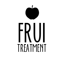
This is the one that I am liking the most. The idea behind it was to separate the words fruit and treatment so it didnt end up making some stupid word that no one could understand. Frui on its own can be used as a nick name for the hair care products and when its said as Frui Treatment, it sounds like fruit treatment. It looks better visually and also as a brand name.


With this one I tried out a different layout, but there is something unbalanced about it. The word treatment being a longer word means that it is standing out more than the word Frui, which doesnt make any sense.


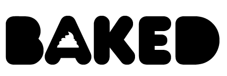
This is the first logo that I chose out of the many I had designed. It looks ok but the fact that its harder to read means that I probably wont be using it.


I took these three designs to Robot Food along with another brief so that I could get feedback. Here are a fewer pointers they made:
  • The first thing they said was that the third logo here reminded them of Innocent Smoothie, which wasnt at all what I was going for.
  • The first logo was their favourite and the one they thought worked best. 
  • They said I should make the fruit bigger so that the type and illustration line up together.
  • Each different product should have a different fruit above the logo to give variation.
  • Think of a better tag line as I dont need to have the word treatment in the logo and the tag line.
They helped me with the tagline and thought of one 'Natural Nourishment', so it was clear that the natural ingredients (fruit) nourished your hair.

I have decided to take the first logo further as myself and Robot Food felt it worked the best and had room for development.


Baked/ Robot Food crit


After making good friends with the guys at Robot Food and them telling me if I need any help, to get in contact. So I did. I tweeted them saying I needed some help with a logo I was working on and asked for their advice. They tweeted back saying I could either ring them or go in and speak to them. I chose to go in and speak to them because it was an opportunity to see them again properly and they would be able to see the logos I was working on and give me some good advice.

These are the logos I took, which are for the Baked brief. I have been a bit stuck with which logo to take forward. These four are the strongest out of all the ones I have designed, but there is stills something not quite right about them.

Heres some pointers they made about these logos:


  • Why is the type coming out of the muffin on the first logo?
  • Why does the type have a messy drop shadow?
  • Try using the muffin top to make the counter of the letter A in logo two
  • Maybe try and make a birds eye view of piped icing and use it for all the counters on the second logo
  • Try and put the icing of the muffin and the base together without a gap on logo one
I took on board their feedback and tried out these changes.


This is the one where I have used a birds eye view of piped icing in replacement of the counters. They suggested using different colours and then placing them around the type. The idea was to make it look girly. I dont like it and I dont think it works.


I do kind of like the piping as the counter in the letter A, but to me there is still something missing. I think in my head I had already decided that I liked the logo with the muffin.


This is one of the logos where they told me to try and get rid of the gap between the icing and the base of the muffin and then centralise the type in the shape and make sure it isnt over hanging the muffin. To me this makes it look even more unbalanced, there is something that just doesnt look right. It might be that now the type is smaller, the muffin looks too big.


This logo is very similar to the original but I have made some small changes that have made a big difference. I have got rid of the weird drop shadow thing from the letters and still left them sitting slightly outside of the muffin. But it now looks part of the muffin. I have also changed the tag line of the cake shop after the guys at Robot Food didnt understand it. They helped me think of one and we came up with 'How you like cakes'. The idea was to think of something that either explained what the shop was or sold the shop. Baked make cakes the way you like them and they are better than anywhere else. That was the idea.


SP&PT Year Book/ Finalising a cover design


Typeface: Century Gothic

This is the original design that everyone had chosen to take forward as the final design for the front cover of the SP&PT Year Book. I designed this one and explained in a previous post my thoughts behind the design. As a group we discussed the design and thought of things that needed to be tweaked. Things that came up were:

  • The typeface needed changing as people didnt think it worked as well as it could and that something else would be more suitable.
  • I forgot to put on 'Leeds College Of Art', so that needed adding at the bottom.
  • I hadnt put '2010-13', so that has been changed.
  • Some of the coloured squares interfered with the text so it couldnt be read very well, so I needed to flip the pattern around until it worked.


Typeface: Helvetica Neue

I tried using Helvetica Neue for the front cover but it still didnt look right to some of us, we are using Helvetica for the body copy. I had flipped the squares so that the yellow didnt make the text hard to read but it still does with this particular layout.


Typeface: Calibri

I really liked Calibri as it had a slight curve to it which I think softened it down to compliment the colours, but the group still werent sure.


Typeface: Futura

Claudia then suggested using Futura for the front cover, which I think looks really good and works well. Its well balanced and because of the bigger weight it meant some of the letters were still readable when they were placed over the yellow squares. I had flipped the pattern so it was the main title that sat on the yellow which made definite that the smaller type could be read.

There is still room for improvement on the design as we dont really like the pointedness of the letter N, so we are going to try and edit it slightly if we can, or again choose another more suitable typeface.


Year Book PT&SP/ Front cover design


Here are some initial ideas for the front cover design of the Surface Pattern and Printed Textiles Year Book. Me and Kirsty A were given the task of designing a front cover for the year book. The front cover needed to reflect on the course and its personality without being biased towards anyones work or a particular design approach within the course.

As a group we came up with the idea of using squares, there would be enough squares for each student, one for the course team and then one for us as a group. We thought about having the squares different colours to individually represent the students and the course team.

I experimented with using a set amount of colours rather than using 64 different colours as I feel it looks better. Having 64 different colours could have made the cover look either too messy or to busy and I didnt want either of those things to happen.

The colours are a range from throughout the colour spectrum and eventually go back to the first colour, so that it goes all the way through.

I then experimented with aligning up the different coloured squares into patterns that were quite formalised to try and keep it as simple as possible. I tried overlaying different coloured squares to make more colours and make a pattern.

The typeface that I used was my all time favourite Century Gothic, we needed something similar to Helvetica, in terms of weight and a sans serif. I think Century Gothic worked very well, it is readable and works well with the soft pastel colours.

Tuesday 9 April 2013

Hair Care/ Logo initial ideas


These are some initial ideas for the logo of my hair care product brief. After researching into hair care product range logos, it soon came to light that a lot of brands heavily use type as part of their logo with maybe another image element that has much less hierarchy. With these designs I have used sans serif typefaces that are quite smooth and have a low weight. I think it makes the logo feel more feminine and also a bit more high end.

I want my product range to be on the same sort of level as Herbal Essences within the market of hair products, but I want my range to be a bit more fun yet sophisticated.

The logo in the different colours on the other side is the one that I am going to be developing as I feel it works really well. The name came from the idea of a fruit treatment. I tried out using the letter t for bother words by putting them together but it just looked like I couldnt spell or something. So I have moved the frui on top of the treatment, so its easier to understand but when you say it it still sounds like fruit treatment. Genius I think.

I have then used the apple on top as I think an apple is the most common and easily recognised piece of fruit.

Fruit and its hair benefits/ Research

I have been looking into the use of fruit within hair care products and the benefits that various fruits have when it comes to taking care of your hair.


http://www.naturallycurly.com/curlreading/products-ingredients/fruits-that-are-good-for-your-hair-yes-avocado-is-a-fruit


  • Fruits are full of nutrients and vitamins that are good for hair
  • Dark coloured fruits like plums and dark berries have nutrients called bioflavonoids that also act as antioxidants
  • Citrus fruits such as oranges and grapefruits have vitamin c and antioxidants. Many of these fruits have antioxidants that help increase circulation to the scalp, which encourages hair growth
  • Fruits like apples, apricots, peaches, bananas and watermelons are not only sweet, but are also hair growth boosters
  • The secret ingredient in these fruits is the nutrient biotin
  • Biotin has been heralded as the natural growth steroids for hair and nails
  • Studies show that biotin promotes hair growth and infuses strength and thickness into every strand
  • The powerhouse fruit for hair health is avocado. Avocado's are rich in vitamin a and antioxidants. The fruit is a natural moisturiser that helps hair growth. Avocado's are great for damaged hair
  • Avocado's are also a natural sunscreen, it can leave hair stronger, shiny and healthy, as well as less prone to breakage


  • Bananas are rich in potassium and vitamins a,c and e, bananas are ideal for skin and hair (they help restore dull and damaged hair)
  • Apple juice applied to your scalp helps prevent dandruff. A final rinse of your hair with apple juice after shampooing brings about an added shine. Apples are also a good conditioner and toner


  • Coconut oil enhances shine and gives an incredible glossy softness to the hair. It has anti fungal and anti microbial qualities that help combat dandruff and bacterial scalp infections. Coconut oil is even believed to slow hair loss by revitalising and exfoliating dead skin tissue from the scalp
  • Unlike coconut oil, coconut milk contains protein, which strengthen hair and can help to minimise breakage. It also has roperties which protect hair and scalp from uv rays

This research will give me a starting point in this brief as to which fruits I will be using for my hair care products.

Hair Care Logo Design/ Research


There are so many different hair care brands out there with very different logos, but the one thing I have noticed that they have in common is that the main aspect of their logo is type based. This leads me to believe that its probably wise to stick to something like this as it seems to work very well. I also need to think of a name for my brand which im unsure about.

Hair Care Product Range/ Research


Holly Prince- Student Work


Cookchick


All images and websites were found via www.lovelypackage.com