
After making good friends with the guys at Robot Food and them telling me if I need any help, to get in contact. So I did. I tweeted them saying I needed some help with a logo I was working on and asked for their advice. They tweeted back saying I could either ring them or go in and speak to them. I chose to go in and speak to them because it was an opportunity to see them again properly and they would be able to see the logos I was working on and give me some good advice.
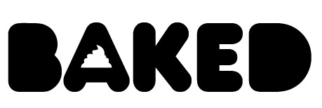
These are the logos I took, which are for the Baked brief. I have been a bit stuck with which logo to take forward. These four are the strongest out of all the ones I have designed, but there is stills something not quite right about them.
Heres some pointers they made about these logos:
- Why is the type coming out of the muffin on the first logo?
- Why does the type have a messy drop shadow?
- Try using the muffin top to make the counter of the letter A in logo two
- Maybe try and make a birds eye view of piped icing and use it for all the counters on the second logo
- Try and put the icing of the muffin and the base together without a gap on logo one
I took on board their feedback and tried out these changes.

This is the one where I have used a birds eye view of piped icing in replacement of the counters. They suggested using different colours and then placing them around the type. The idea was to make it look girly. I dont like it and I dont think it works.
I do kind of like the piping as the counter in the letter A, but to me there is still something missing. I think in my head I had already decided that I liked the logo with the muffin.

This is one of the logos where they told me to try and get rid of the gap between the icing and the base of the muffin and then centralise the type in the shape and make sure it isnt over hanging the muffin. To me this makes it look even more unbalanced, there is something that just doesnt look right. It might be that now the type is smaller, the muffin looks too big.

This logo is very similar to the original but I have made some small changes that have made a big difference. I have got rid of the weird drop shadow thing from the letters and still left them sitting slightly outside of the muffin. But it now looks part of the muffin. I have also changed the tag line of the cake shop after the guys at Robot Food didnt understand it. They helped me think of one and we came up with 'How you like cakes'. The idea was to think of something that either explained what the shop was or sold the shop. Baked make cakes the way you like them and they are better than anywhere else. That was the idea.
No comments:
Post a Comment